As a design apprentice at Upstatement, I was part of a small, dedicated team that worked with Harvard Business Review to establish their brand on Snapchat. Our challenge was to uphold the brand while modifying it for the younger Snapchat audience. In this age of low attention spans, publishing on Snapchat was also an experiment in condensing HBR magazine’s content to be consumed quickly.
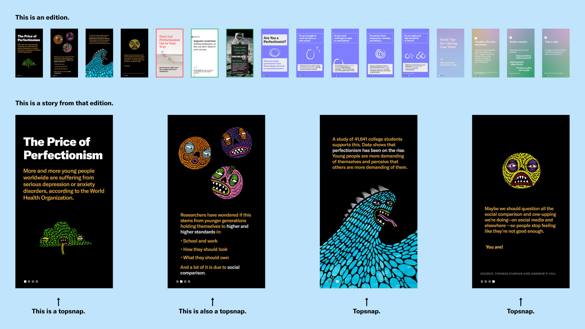
Each week of the project, Upstatement and HBR worked together to write, design, animate, edit, and publish an edition to the Snapchat platform. An edition is a collection of stories to be swiped through by the Snapchat user. Each story consists of a number of individual snaps, called topsnaps. This is visualized below:

My role on the project consisted heavily of design and animation. On Snapchat, every topsnap is animated. Users of the platform swipe fast, and animation keeps people reading.

Much of our strategizing was baked into the design work. One eye on analytics, we experimented with how to begin an edition, how many topsnaps should be in a story, and when users should swipe up to read more. When Upstatement’s time with HBR came to an end, we were able to transfer not just roles, but a wealth of knowledge on how to best speak to this easily distracted new audience.